Cannabolish
BRANDING | PACKAGING | DIGITAL | PRINT
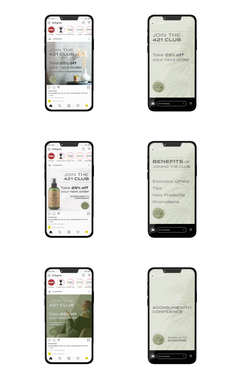
Founded in nature, backed by science, Cannabolish plant-based formulas safely and effectively eliminate smoke odors. Whether you’re a daily smoker, casual connoisseur, or canna mom, Cannabolish allows you to consume confidently odor-free. Tasked with creating the brand identity for this new product line and rolling that out into packaging, displays, print and digital collateral.
The logo is a geometric, modern, symmetrical take on the cannabis leaf itself. Mathematical in structure to represent the science behind the product. The color selection was all about replicating muted earth tones, colors that are found in the natural elements of cannabis. Icons and typography were all created and chosen to be easy to read, minimal and simplistic. Lifestyle photography should always be clean, minimal with smooth contrast and neutral color tones. Overall, Cannabolish should make you feel the comforts of home, warmth, relaxation, safe and trustworthy.


